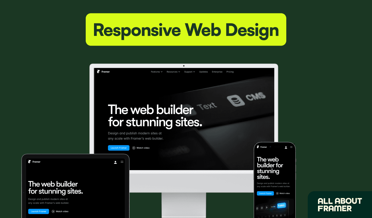
How to Build a Fully Responsive Website in Framer
A practical 2026 responsive-design walkthrough covering breakpoints, fluid type, stack-based layouts, and mobile-first components like navbars, heroes, and forms.
Why we picked it
It directly addresses the most common beginner struggle — making Framer sites look right on every device — with concrete breakpoint values and component patterns.
What you’ll learn
- Set up breakpoints from 1920 px down to 390 px
- Use stacks and relative units instead of absolute positioning
- Adapt common components for mobile
- Test across devices and optimize images for speed
Who it’s for
Beginners and intermediate designers building sites that must work on desktop, tablet, and mobile.
Open this article at the source
allaboutframer.com
Related tutorials
More from design patterns and other beginner resources3 picks
Utilizing collection lists in Framer
Official lesson on repeating indexes: insert a collection list, bind card fields, then sort, filter, limit, and paginate.
How to add dynamic filters to CMS lists
Help Center guide to interactive filters — search, tabs, toggles, dropdowns, and checkboxes on published collection lists.

Framer CMS Tutorial: Build a Blog or Portfolio
Step-by-step 2026 article for shipping a blog or portfolio: collections, fields, detail pages, lists, filters, and CMS SEO basics.